React と Tailwind CSS で縦方向のカルーセル(スライダー)を実装したい
はじめに
久しぶりのブログ更新です。
このサイトを見ていたら「ページ全体で縦方向にスライドするページって良くね…?」って思い実装意欲が湧いたので、実際に作ってみました。 僕と同じで縦方向にスライドするページの良さに目覚めたら参考にしてください。
技術選定
実行環境
今回は TS + React + Tailwind CSS で作ることにしました。実行環境は以下の通りです。
- Node.js v15.14.0
- yarn 1.22.10
- typescript@3.9.3
- tailwindcss ^2.2.19
どうやるか?
React でスライドを実装するライブラリはそこそこあって、どれも悪くはないのですがなんでそう動いているのかわかりにくいというのがなんとなく嫌でした。
というわけで、勉強もかねて今回はなるべくJSやCSSを駆使して自分で実装をしていく方向性でいきます。
縦方向のスライドで重要なのが、画面スクロールに対してページ移動をコントロールすることです。
そこで目をつけたのが Intersection Observer です。
Intersection Observerとは?
MDNの説明は以下の通りです。
Intersection Observer API (交差監視 API) は、ターゲットとなる要素が、祖先要素もしくは文書の最上位のビューポートと交差する変更を非同期的に監視する方法を提供します。
要は、画面外でスクロールしてはみ出した部分と交差したところを監視して、それに合わせて動作を起こせるというAPIみたいです。
Scroll イベントでの発火で操作するよりパフォーマンスもいいらしいので、なんかいい感じですね!
react-intersection-observerを使う
良さげな Intersection Observer API をそのまま使っても良かったのですが、React には react-intersection-observer という便利なライブラリがあるみたいで、すごい使いやすそうなので使っていきます!
yarn コマンドで入れていきましょう。
$ yarn add react-intersection-observer
実装
Reactの細かい環境や設定はそれぞれ好きなようにしましょう。
1. スクロールが止まる部分の実装
まずは画面をスクロールしたらピタッと止まるようにします。
そのためには、CSSの scroll-snap-type を設定します。1つ目の値にスナップさせるスクロール方向、2つ目の値に厳密さを指定します。
大きさは横幅100%、縦幅100vhを指定して、今回は縦スクロールなので overflow-y: auto を指定しています。
これらをCSSで記述するとこのようになります。
親要素 {
  width: 100%;
  height: 100vh;
  scroll-snap-type: y mandatory;
  overflow-y: auto;
  -webkit-overflow-scrolling: touch;
}
そして、小要素に scroll-snap-align: start を追加することで、スクロールが止まる位置を決定します。
子要素 {
  width: 100%;
  height: 100vh;
  scroll-snap-align: start;
}
これらを Tailwind CSS で記述すると以下のようになります。
Tailwind には scroll-snap-type と scroll-snap-align で欲しい値がないので、自分でutilities に設定しましょう。
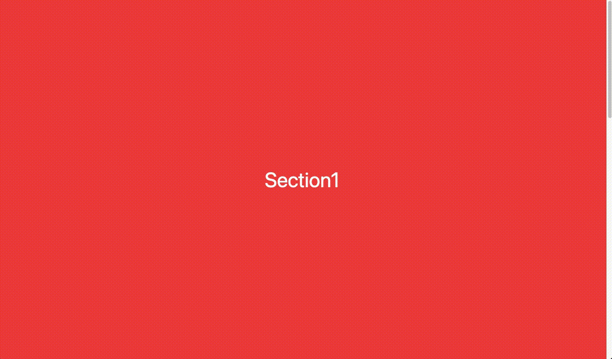
import { FC } from 'react'

const Index: FC = () => {
  return (
    <div className="w-full h-screen snap overflow-y-auto scrolling-touch">
      <section
        id="section1"
        className="w-full h-screen snap-start flex justify-center items-center bg-red-500 text-5xl text-white"
      >
        Section1
      </section>
      <section
        id="section2"
        className="w-full h-screen snap-start flex justify-center items-center bg-yellow-500 text-5xl text-white"
      >
        Section2
      </section>
      <section
        id="section3"
        className="w-full h-screen snap-start flex justify-center items-center bg-green-500 text-5xl text-white"
      >
        Section3
      </section>
    </div>
  )
}

export default Index
@tailwind base;
@tailwind components;
@tailwind utilities;

@layer utilities {
  .snap {
    scroll-snap-type: y mandatory;
  }
  .snap-start {
    scroll-snap-align: start;
  }
}
以下のようになります!
2. ページネーションの実装
右側に表示するページネーションを実装します。
特別なことはないので、ここの説明は省略します。
以下を追加しましょう。
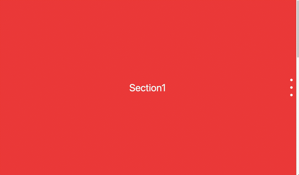
//親要素のdivタグの中に追加
<nav id="pagination" className="fixed top-1/2 right-8 nav-transform">
  <a
    className="block w-3 h-3 my-6 rounded-full bg-white pagination-transition"
    href="#section1"
  />
  <a
    className="block w-3 h-3 my-6 rounded-full bg-white pagination-transition"
    href="#section2"
  />
  <a
    className="block w-3 h-3 my-6 rounded-full bg-white pagination-transition"
    href="#section3"
  />
</nav>
/* utilitiesに追加 */
.nav-transform {
  transform: translateY(-50%);
}
.pagination-transition {
  transition: transform 0.2s;
}
以下のようになります!
3. 現在表示中のスライドの取得
ページネーションですが今いるスライドの点を大きくしたりして、わかりやすくしたいですよね!
そのためには現在どのスライドが表示されているのかという情報を管理する必要があります。
そこでついに先ほど紹介した react-intersection-observer の出番です!
react-intersection-observer では、以下のようなHooksが用意されており、Intersection Observer API の機能を使うことができます。これがとても使いやすい!!
const [ref, inView] = useInView({
    //パラメータをここに書く
});
ref には監視するDOMの情報が入り、inView には監視している部分が表示されていれば true が、表示されていなければ false が入ります。
この値をそれぞれ組み込んでいきましょう。
inView によってclassNameの値を変更したいので、classNamesというライブラリを使います。
$ yarn add classnames
以下のようにHooksの追加と、 section と a タグに値を追加・変更していきましょう。
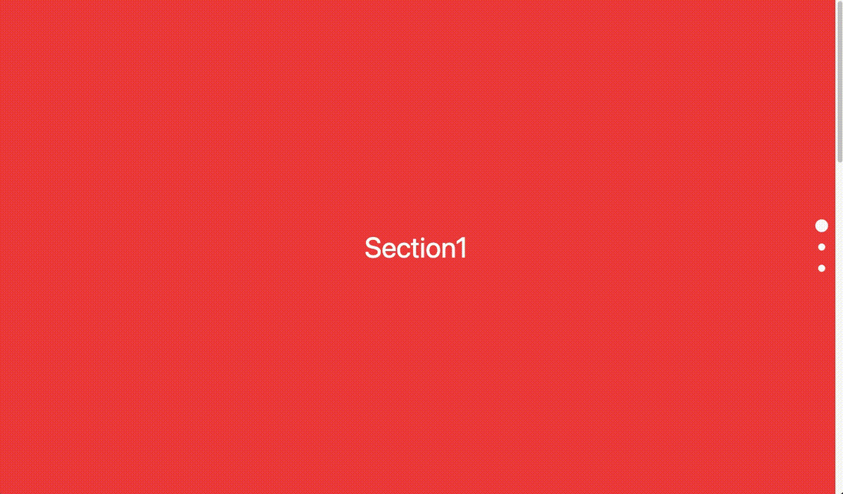
//classnamesをインポート
import ClassNames from "classnames"

//Hooksの設定(sectionの数だけ作る)
const [ref1, inView1] = useInView({
  rootMargin: '-50% 0px',
  threshold: 0,
})

//sectionタグにrefを追加
ref={ref1}

//aタグのclassNameを変更
className={ClassNames(
  'block w-3 h-3 my-6 rounded-full bg-pagination-white pagination-transition',
  inView1 ? 'pagination-active' : ''
)}
/* utilitiesに追加 */
.pagination-active {
  transform: scale(1.8);
}
以下のようになります!

4. スムーススクロールの実装
最後に、ナビゲーションをクリックした時にスクロールがスムーズに動くようにしましょう!
クリックした場所に対応するsectionのidを取得して、scrollIntoView() メソッドを使ってスムーズにスクロールをするようにします。
以下のような関数を作って、a タグをクリックしたときにその関数を呼び出しましょう。
//スムーススクロールをする関数
const smoothScroll = (event: MouseEvent<HTMLElement>) => {
  event.preventDefault()
  const eventTarget = event.target as HTMLAnchorElement
  const eventTargetId = eventTarget.hash
  const scrollTarget = document.querySelector(eventTargetId)
  if (scrollTarget) {
    scrollTarget.scrollIntoView({ behavior: "smooth" })
  }
}

//aタグにonClickを追加
onClick={e => smoothScroll(e)}
以下のようになります!
全体のコード
これで完成となるので、今までの実装をしたものを以下に載せておきます!
import { FC, MouseEvent } from "react"
import { useInView } from 'react-intersection-observer'
import ClassNames from "classnames"

const Index: FC = () => {
  const [ref1, inView1] = useInView({
    rootMargin: '-50% 0px',
    threshold: 0,
  })

  const [ref2, inView2] = useInView({
    rootMargin: '-50% 0px',
    threshold: 0,
  })

  const [ref3, inView3] = useInView({
    rootMargin: '-50% 0px',
    threshold: 0,
  })

  const smoothScroll = (event: MouseEvent<HTMLElement>) => {
    event.preventDefault()
    const eventTarget = event.target as HTMLAnchorElement
    const eventTargetId = eventTarget.hash
    const scrollTarget = document.querySelector(eventTargetId)
    if (scrollTarget) {
      scrollTarget.scrollIntoView({ behavior: "smooth" })
    }
  }

  return (
    <div className="w-full h-screen snap overflow-y-auto scrolling-touch">
      <section
        ref={ref1}
        id="section1"
        className="w-full h-screen snap-start flex justify-center items-center bg-red-500 text-5xl text-white"
      >
        Section1
      </section>
      <section
        ref={ref2}
        id="section2"
        className="w-full h-screen snap-start flex justify-center items-center bg-yellow-500 text-5xl text-white"
      >
        Section2
      </section>
      <section
        ref={ref3}
        id="section3"
        className="w-full h-screen snap-start flex justify-center items-center bg-green-500 text-5xl text-white"
      >
        Section3
      </section>

      <nav id="pagination" className="fixed top-1/2 right-8 nav-transform">
        <a
          className={ClassNames(
            'block w-3 h-3 my-6 rounded-full bg-white pagination-transition',
            inView1 ? 'pagination-active' : ''
          )}
          href="#section1"
          onClick={e => smoothScroll(e)}
        />
        <a
          className={ClassNames(
            'block w-3 h-3 my-6 rounded-full bg-white pagination-transition',
            inView2 ? 'pagination-active' : ''
          )}
          href="#section2"
          onClick={e => smoothScroll(e)}
        />
        <a
          className={ClassNames(
            'block w-3 h-3 my-6 rounded-full bg-white pagination-transition',
            inView3 ? 'pagination-active' : ''
          )}
          href="#section3"
          onClick={e => smoothScroll(e)}
        />
      </nav>
    </div>
  )
}

export default Index
@tailwind base;
@tailwind components;
@tailwind utilities;

@layer utilities {
  .snap {
    scroll-snap-type: y mandatory;
  }
  .snap-start {
    scroll-snap-align: start;
  }
  .nav-transform {
    transform: translateY(-50%);
  }
  .pagination-transition {
    transition: transform 0.2s;
  }
  .pagination-active {
    transform: scale(1.8);
  }
}
まとめ
長くなりましたが、これで自分で縦方向のカルーセル(スライダー)を実装することができました! スライドの中身は自由に変更ができるので、好きなように作成をしましょう!
僕はこれで自分のポートフォリオサイトを作ったので、ぜひ参考にしてください!